HTML and CSS Reference
In-Depth Information
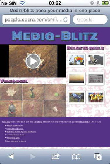
MOBILE
BROWSERS LIE
!
FIGURE 8.11
This isn't what
was expected! Why aren't the
narrow-screen media queries
being applied on mobile
browsers?
There is more to optimizing content for mobile devices using media queries than
you might first think. If you view one of the media query examples you've seen so
far in this chapter on a mobile phone, you'll see the surprising result shown in
Figure 8.11
.
NOTE:
Yo u m i g h t a l s o g e t s l i g h t l y o d d p o s i t i o n i n g o r o t h e r b e h av i o r
of the video depending on the mobile device viewing the content,
because some mobile browsers will play the video inside the browser,
whereas others hand off the video playing to the device's native player.
The problem here is that mobile browsers lie. When a mobile browser renders
the average site, it doesn't render it at the actual browser width and display it as is.
Instead, it renders the site at a higher assumed width—Opera Mobile, for example,
uses 850px (and sometimes goes wider, depending on how wide the page being
rendered is)—and shrinks the result to fit on the mobile screen.