HTML and CSS Reference
In-Depth Information
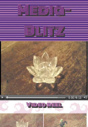
FIGURE 8.10
The fourth and
fifth layouts work well for
portrait and landscape mobile
phones.
The fourth media query puts all the major containers in a single column but
puts the Related Reels into two columns again:
@media all and (max-width: 600px) {
.
}
The final media query kicks in at 350 pixels or less, which reduces the Related
Reels to a single column again and makes the
<h1>
smaller:
@media all and (max-width: 350px) {
.
}
Figure 8.10
shows the final two layouts in action.