HTML and CSS Reference
In-Depth Information
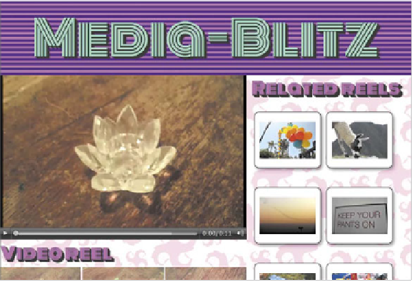
FIGURE 8.8
The result of the
first media query kicking in.
The navigation menu moves
from the side of the site down
to the bottom, and the rest
of the content expands to
span the entire width of the
browser.
Yo u f o r c e t h e is e r u l e is t o k i c k i in w h e in t h e b r o w is e r w i in d o w i is l e is is t h a in 1 0 2 4
pixels in width. When they kick in, you remove the float from the
<nav>
, change
its width to 100%, and get rid of the left margin from both the
<nav>
and the
#main-panel
so that the location of the navigation menus changes from the side
of the layout to the top of it. You then set the list items to
display: inline-block
so they sit alongside one another rather than on top of one another, do a couple of
other minor adjustments there, and then use some CSS tables magic to relocate the
navigation to the bottom of the site instead of the top.
Figure 8.8
shows the result.