HTML and CSS Reference
In-Depth Information
FLEXIBLE
LAYOUT
TECHNIQUES
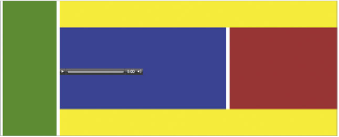
Nav 220px
Media Blitz 100%
Media 60%
Related media 39%
FIGURE 8.3
A raw flexible
layout.
Video reel 60%
Footer 100%
So far in this topic, I've deliberately not considered responsive design very much
because I wanted to dedicate this chapter to it! However, you've already seen some
of the elements of responsive design without even knowing it, mainly the flexible
techniques I'll talk about in this section.
CONTAINERS THAT BREATHE
The first important optimizing technique is sizing containers in percentages to
allow your containers to breathe a little so the layout will still look OK and fit in
slightly different screen sizes. This is demonstrated by the main example I'll use
in this chapter, which is a responsive media site called Media Blitz. You can find
the finished version in the media_blitz folder in the code download files. So hop
on over to the chapter8 folder and open the file media-blitz-1-base-layout.html
file to start with. This file literally just includes the raw container layout informa-
tion (
Figure 8.3
).
This layout was pretty easy to put together. The code should be self-explanatory
if you know your basic CSS. Don't worry about the height of the content right now.
Instead, focus on the fact that however you resize your browser window, the dif-
ferent blocks keep to the indicated proportions because the containers are all sized
using percentages.
NOTE:
In the future when browser support is better, you'll be
able to create flexible layouts in a much easier way, with
less markup, using some of the advanced layout techniques
in Chapter 7. For now, I've just stuck to good ol' floats.