HTML and CSS Reference
In-Depth Information
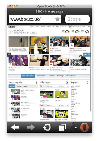
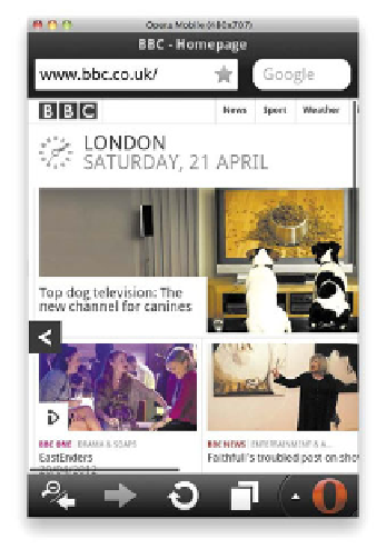
FIGURE 8.2
Most mobile
phone browsers have zoom
functionality, as illustrated
here in the Opera Mobile
Emulator for desktop (available
Mobile device browsers tend to display a zoomed-out version of web pages
and then provide zoom features to enable you to see different parts of the content
more closely (
Figure 8.2
).
SERVE DIFFERENT SITES TO DIFFERENT DEVICES
So doing nothing can make your content accessible on most browsers, but often
you'll want more control over how your content looks on different devices, and
your client will want a more tailored approach. How many times has your client
or boss said, “I want an awesome iPad app”? Also, various browsing contexts will
often call for different content. Mobile phone users frequently want to just browse
to a website quickly to find train times, look up a map, or play a little throwaway
game because they are bored. They don't want to see pages of staff bios or a giant
movie featuring your company's CEO explaining your company history.
It is therefore a good idea to, for example, serve mobile users a different set
of content by default—a mobile version of the site that just contains the most
important features a user might want to use on the move. Traditionally, this is
done by detecting what user agent string a browser has and redirecting the browser
to a mobile version of the website, perhaps at mysite.mobi instead of mysite.com.