HTML and CSS Reference
In-Depth Information
RESPONSIVE
DESIGN
STRATEGIES
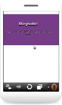
FIGURE 8.1
Graceful degradation of CSS3 bling in Opera 12 desktop (left)
and in Opera Mini 6 (right).
Broadly speaking, there are three main strategies for optimizing web content across
different devices. Let's look at each one in detail.
DO NOTHING SPECIAL
Do nothing special sounds great, huh? The truth is that as long as you create web
content using open standards and best practices, as detailed in this topic and other
decent learning resources, your content will probably be accessible across most
devices. The web is responsive by default. The
<body>
element will cover 100 per-
cent of the browser window width unless you tell it not to. And if you use floats to
arrange repeated content blocks in rows and size containers in percentages rather
than absolute measurements, your layout will have some degree of flexibility as
browser windows become narrower.
In addition, many HTML5 and CSS3 features will degrade gracefully in nonsup-
porting browsers. As you can see in my CSS bling example in Opera 12 (
Figure 8.1
,
left) and in Opera Mini 6 (Figure 8.1, right), many of the bling effects don't work in
Opera Mini, but the content is still readable.
NOTE:
The Opera Mini screen shot shown in Figure 8.1
is actually taken from the Opera Mini simulator, which is
available at
www.opera.com/developer/tools/mini.


