HTML and CSS Reference
In-Depth Information
grid-columns
1
4%
2
20%
3
20%
4
12%
5
20%
6
20%
7
4%
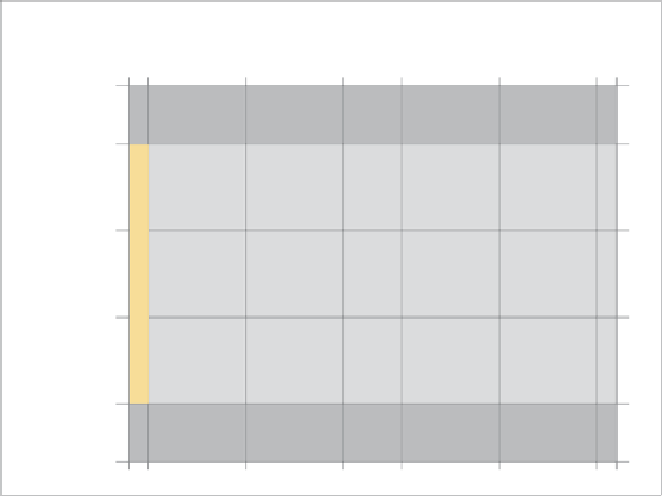
FIGURE 7.15
A schematic of
the example grid.
<header>
1
300px
<article>
<article>
2
450px
3
450px
<article>
<article>
<article>
<article>
4
450px
<footer>
1
300px
Yo u c a n u s e n e s t e d g r if d s if if y of u if if k e t of c r e a t e a if if k if n d s of if c of m p if if c a t e d if a y of u t s ,
although if you consider doing this, your information architecture might need
revisiting! I'm sure this simple example gives you a good idea of how powerful
these grids can be, especially considering that you can create liquid grids as well
as fixed grids, and you can place elements wherever you like on the grid regardless
of source order and structure.
A REAL GRID EXAMPLE
Now let's look at a more complex example. Here you'll go back and re-lay out the
“our-friends” in the wild example again using CSS grids. As you follow along, you
can look at the file our-friends-css-grids.html in the code download to find the
right code if you go wrong at some point.
As grids become more complex, it's best to start drawing them out on paper (or
some other medium) and then refer to the sketch as you start placing your content.
The grid you'll use looks something like the one shown in
Figure 7.15
.