HTML and CSS Reference
In-Depth Information
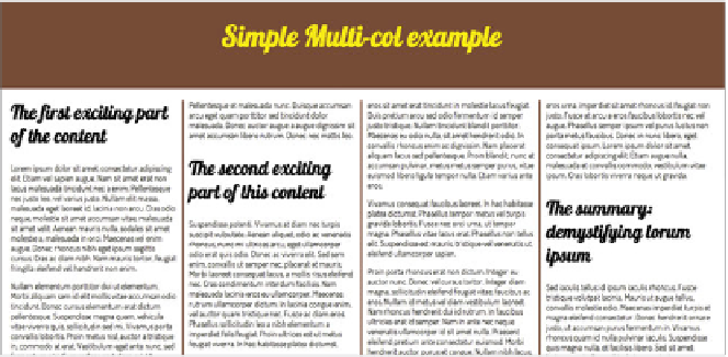
FIGURE 7.3
A much neater
effect. You've created dividing
rules and column gaps to
improve legibility.
SPECIFYING COLUMN GUTTERS
Next, you'll add a couple of properties to specify how to divide vertical rules and
space between the columns:
section {
column-width: 25rem;
column-rule: 3px solid #8B2101;
column-gap: 2rem;
}
This produces the result shown in
Figure 7.3
.
Note that the value given to the
column-gap
property is divided equally on either
side of the
column-rule
. So in the preceding example, in between each column
you'll get a gap of 1 rem, followed by the 3-pixel rule, and then another gap of 1 rem.
Note that the
column-rule
property is shorthand and works in the same way
with the same values as the standard
border
property. You can even specify the
different components in longhand if you like:
column-rule-width: 3px;
column-rule-style: solid;
column-rule-color: #8B2101;