HTML and CSS Reference
In-Depth Information
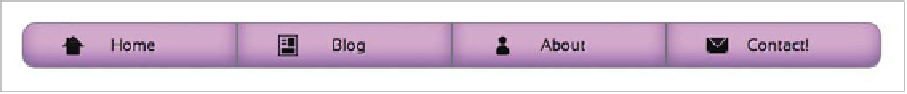
FIGURE 6.18
The menu example using Peculiar icons.
Here I've set the position to
absolute
so that I can move the icons into position
and moved them using
top
and
left
. I've also used a transform to set the desired
size of the icons. This was needed because the icon shapes are dependent on the
16 x 16
width
and
height
. If you mess with those dimensions, the icons become
distorted.
The only step left to do is to set the icons' parent containers—the anchors—to
be positioned, so that the position I set on the icons earlier will happen relative to
them, not the
<body>
or another positioned ancestor:
ul a {
: ;
.
}
Figure 6.18
shows the result.
Now, this technique may seem pretty damn complicated for producing a set of
simple icons, but it does have its advantages. Creating icons in pure CSS completely
does away with those extra HTTP requests needed for downloading images or web
fonts, and the file sizes are kept very small.
They are also infinitely scalable and manipulable (you can grab each icon and
change its size, shape, color, and so on to suit the situation), and are great for web
developers who don't like to use Photoshop very much. Creating such icons does
require using
border-radius
a lot, which doesn't work in IE 6-8, but support can
be added via the use of your old friend CSS3PIE, which you first met in Chapter
4. The transform also won't work in old versions of IE, but the overall result looks
OK, albeit with smaller icons.
I urge you to learn from these icons and try your hand at creating your own!
And please send Lucian Marin flowers and cake, because it is truly a cool idea.