HTML and CSS Reference
In-Depth Information
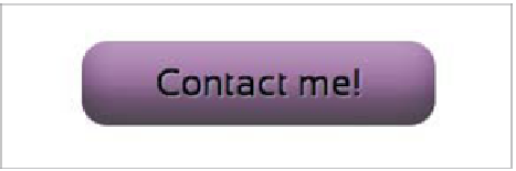
FIGURE 5.18
A simple, well-
styled button.
SELECTING WHAT TO TRANSITION
To d e m To n s t rat e t ra n s i t i To n b a s i c s , l e t 's wa l k t h ro u g h b u i l d i n g u p a v e r y s i m p l e
button example (see transition-button.html in the chapter5 folder). The button is
simply a link styled to produce depth and shadowing using a combination of box
shadow, linear gradients, text shadow, and more (
Figure 5.18
). There is nothing
remarkable here except perhaps to say that I've used an inset box shadow to give
the gradient a bit more shape.
When the link is moused over or focused via the keyboard, the background color
changes (as dictated by the
:hover
/
:focus
states), and when the link is clicked/
activated, another stronger, inset box shadow is applied to give the button the look
of being pressed in. This is standard fare on the web, but I'm sure you'd agree that
the experience could be better if the state changes were a bit smoother.
Yo u c a n d o t h i s v e r y e a s i l y b y s e t t i n g a t r a n s i t i o n o n t h e l i n k , a s f o l l o w s :
a {
.
transition-property: background-color;
}
Yo u m u s t s e t t h e t r a n s i t i o n o n t h e e l e m e n t y o u w a n t t h e t r a n s i t i o n t o o c c u r o n .
transition-property
takes as its value the property you want to transition upon
state change.
NOTES:
Notice from the code examples in this section that the transition properties
currently need prefixes.
Not all CSS properties are animatable via CSS Transitions and Animations, but
most of the ones you'd conceivably want to animate are. A list of animatable
properties is available in the CSS Transitions spec in the Animatable Proper ties