HTML and CSS Reference
In-Depth Information
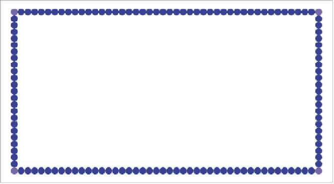
FIGURE 4.38
Border images at
half the size—very funkalistic.
And there's one more detail you should know about the basic syntax. To actually
provide space for your border image, you need to specify a border width, which is
why
border-width: 30px;
was included in the code example. If you don't do this,
you won't see anything. The
border-width
property offers additional interesting
possibilities: If you make the
border width
bigger or smaller than the slices within
the
border-image
property, the slice size will scale up or down to suit. So, if you
make the border half as big, like so:
border-width: 15px;
the border image slices will be displayed in half dimensions, as shown in
Figure 4.38
!
BORDER-IMAGE PROBLEMS
Using
border-image
is not all plain sailing, of course, as with most things in web
design. Aside from the fact that WebKit-based browsers currently don't use the
round
value properly, there are a couple of other issues to keep in mind.
First, you need to determine if you want your central slice to be discarded
or not. You might want the central slice to act as the background for your con-
tainer content, or you might just want to put the border image only in the border.
Unfortunately, the default behavior according to the spec is to discard it, but most
browsers do the opposite, except for Chrome (try comparing border-image-2.html
in Chrome and Opera). You are supposed to be able to control this behavior with
border-image-slice
, but this property is currently not supported in any browser,