HTML and CSS Reference
In-Depth Information
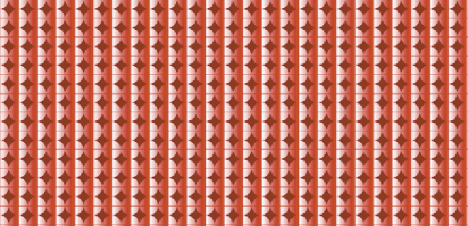
FIGURE 4.32
A rather
interesting pattern created
with multiple gradients and
background-size
.
Another interesting effect to explore is combining a gradient effect with
background-size
to force it to repeat as a single, small, square unit (rather than
along the gradient, as is the case with normal repeating gradients). You'll see this
in action again later on in the topic, too. Consider this example:
background: radial-gradient(transparent 10px, #A60000 11px,
p
#A60000 12px),
repeating-linear-gradient(transparent, transparent 20px,
p
rgba(255,0,0,1) 21px, rgba(255,0,0,1) 21px) 0 -10px,
repeating-linear-gradient(left, transparent, rgba(255,0,0,1) 19px,
p
transparent 21px) 12px 0;
background-size: 21px 21px, 100%;
The effect is shown in
Figure 4.32
. This example is in the file gradient-
background-size.html.