HTML and CSS Reference
In-Depth Information
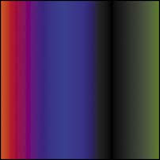
FIGURE 4.15
A gradient with
multiple color stops.
FIGURE 4.16
Italiano, pasta,
meatballs, Roma Roma (well,
not quite).
LINEAR GRADIENT COLOR STOPS
Yo u c a n a l s o a d d m u l t i p l e c o l o r s t o p s b e t w e e n t h e s t a r t a n d t h e e n d p o i n t b y p u t -
ting them between the start and end color stops, like this:
background: linear-gradient(to right,#ff0000,#0000ff 40%,
p
#000000 70%,#007700);
The result is shown in
Figure 4.15
.
The unit values specify the distance away from the start of the gradient. Note
that the percentage values are optional: If you don't specify them, the color stops
will be evenly spaced along the gradient.
Instead of percentages, you can use any units you like that would make sense
in the circumstances. By default, the first and last values are at 0% and 100%, but
you can alter their positions too. For example:
background: linear-gradient(#ff0000 66px, #ffffff 67px,
p
#ffffff 133px, #00ff00 134px);
This effect creates three solid color bands from left to right (
Figure 4.16
). The
green color stop is set at 66px down from the top, and everything before it adopts
the same color. The red color stop is set at 134px, and everything after it adopts the
same color. I also inserted two white color stops in the middle to force the middle
band to be completely white. This technique is very useful, especially if you want
to start creating more intricate and interesting repeating background patterns, as
you'll read about later in the “Multiple Backgrounds” section.