HTML and CSS Reference
In-Depth Information
ADDING DEPTH
WITH
BOX-SHADOW
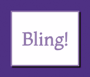
FIGURE 4.5
A basic box
shadow (left).
FIGURE 4.6
Box shadow and
rounded corners together
(right).
-background),
which allows you to add drop shadows to containers. This property
is very useful for adding depth to a design, highlights, and user feedback when used
in conjunction with pseudo-classes and transitions, as you'll see in later examples
(buttons, link highlights, etc.)
The basic
box-shadow
syntax is as follows:
box-shadow: 2px 2px 1px black;
The first two unit values specify the horizontal and vertical offset of the shadow
from the container. Positive values offset the shadow right and down, whereas
negative values offset the shadow left and up. The third unit value specifies the
amount of blur radius the shadow has (this is optional and defaults to
0
if not
explicitly declared). Increase the value for more blurry, spread-out shadows. The
color is, as you'd expect, the color of the shadow.
This basic shadow creates the effect shown in
Figure 4.5
.
Using a subtle shadow like this is ideal for implying just a bit of depth or texture,
making the container look slightly raised.
Now let's add some rounded corners into the mix:
border-radius: 10px;
box-shadow: 2px 2px 1px black;
As you can see in
Figure 4.6
, the shadow follows the shape of the rounded
corners, which is rather convenient.