Biomedical Engineering Reference
In-Depth Information
6
Flu Prediction within Regions
We analyzed the relationship between the OSN activity and ILI rates across all geo-
graphic regions defined by the Health and Human Services (HHS) regions. For refer-
ence, the regions are shown on the USA map in Figure 3.
In studying the regional statistics, we would like to make some comparisons across
regions. For instance (i) when the ILI rate peaks later in a particular region than the rest
of country, do the Twitter reports also peak later, (ii) is there in relationship between the
decay in ILI rates and the decay in Twitter reports.
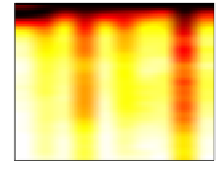
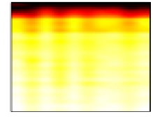
Figure 7 shows, for both ILI (left) and Twitter (right), the relative intensity across
the ten Health and Human Services (HHS) regions (columns) during successive
weeks (rows) in the year 2009-2010 during which the H1N1/Swine Flu was evident.
5
5
10
10
15
15
20
20
25
25
1
2
3
4
5
6
7
8
9
10
1
2
3
4
5
6
7
8
9
10
HHS Region
HHS Region
Fig. 7.
Heatmap of CDC's Regionwise ILI data (left) and Twitter data (right). Colormap scale
included (below).
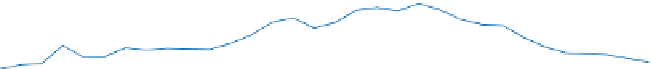
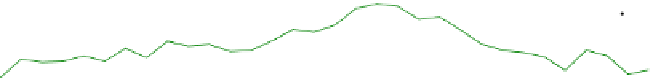
3
CDC ILI rate rate
TW predicted ILI rate
FB predicted ILI rate
TW+FB predicted ILI rate
2.5
Region 1
2
1.5
1
0.5
0
10
CDC ILI rate
TW predicted ILI rate
FB predicted ILI rate
TW+FB predicted ILI rate
8
Region 6
6
4
2
0
6
CDC ILI rate
TW predicted ILI rate
FB predicted ILI rate
TW+FB predicted ILI rate
5
Region 9
4
3
2
1
0
Fig. 8.
Comparision between actual and predicted ILI rates for Region 1, Region 6 and Region 9


Search WWH ::

Custom Search