Biomedical Engineering Reference
In-Depth Information
Since the main difference between the clusters is in the values of the
PC2 score and the
x
coordinate, plotting these should further illustrate the
trend.
In another example of GIII, the same preprocessing outlined in steps 1-6
was used. The SVD indicates that there are three factors that explain most of
the data. The histogram for T1 and T2 is presented in Figure 5.32.
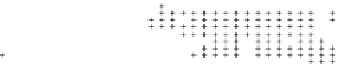
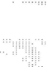
The Matlab function inpolygon was used to find points in polygonal
regions containing the clusters, and the clusters are plotted with their (
x
,
y
)
coordinates given in Figure 5.33. Again, the clusters are evident in the spatial
coordinates as well as the PC coordinates. Plotting spectra averaged at
x
= 5
and
x
= 25 (Figure 5.34).
The same kinds of differences at ~1000 cm
−1
and ~1200 cm
−1
can be observed
in Figure 5.35. The plot of all the spectra shows the differences as well in a
bimodal distribution for T2 presented in Figure 5.36.
A plot some of the original spectra to see what changes in the spectra are
responsible for this behaviour is given in Figure 5.37. The easiest way to do
× 10
-4
1
0
-1
-3
-2.5
-2
-1.5
× 10
-4
T1
Figure 5.32
Histogram for T1 and T2.
30
20
10
0
0
10
20
30
x
Figure 5.33
Polygonal regions containing the clusters, and the clusters are plotted with their (
x
,
y
) coordinates.


Search WWH ::

Custom Search