Information Technology Reference
In-Depth Information
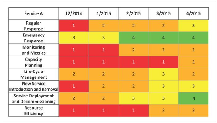
each represent an assessment period. Use a different sub-sheet for each service. Use the
spreadsheet's “insert comment” feature to record notes that justify the assessment value.
Figure 20.1: Assessment of a service
It is a good idea to list the responsibilities in an order that indicates their importance to
that service. For example, a service that does not grow frequently is less concerned with
capacity planning, so that responsibility might be listed last.
Color the squares red, orange, yellow, green, and blue for the values 1 through 5, re-
spectively. This gives a visual indication and creates a “heat map” showing progress over
time as the colors change.
For the person responsible for a service, this tool is a good way to help evaluate the ser-
vice as well as track progress.
20.4.3 Comparing Results across Services
Figure 20.2
shows an example spreadsheet being used to roll up the assessments to com-
pare the services. The services should be listed by order of importance. Each number rep-
resents all eight assessments for that service. The number may be a weighted average or
simply the mathematical “mode” (the most common number). Whatever method you use,
be consistent.
Search WWH ::

Custom Search