HTML and CSS Reference
In-Depth Information
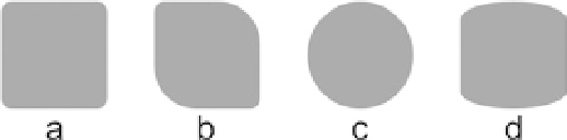
The
border-radius
property can have from one to four values. Each radius value can
be set by using either one value for a circle radius or two values for an elliptical radius.
The value can be either a length or a percentage. If a percentage is used, it is relative to
the container's dimensions. The examples that follow are illustrated in Figure
17-3
:
.a { border-radius: 5px; }
.b { border-radius: 5px 20px; }
.c { border-radius: 50%; }
.d { border-radius: 30px/10px; }
Figure 17-3.
Border-radius examples
The radius for each of the four edges can be set using the four subproperties of
border-radius
. The following example renders the same as the second box in
Figure
17-3
:
border-top-left-radius: 5px;
border-top-right-radius: 20px;
border-bottom-right-radius: 5px;
border-bottom-left-radius: 20px;
border-radius
is a well-supported CSS 3 property. To add support for older
browsers, the
-webkit
and
-moz
browser prefixes can be used.
.round {
/* Safari 3-4 */
-webkit-border-radius: 5px;
/* Firefox 1-3.6 */
-moz-border-radius: 5px;
/* Opera 10.5, IE9, Safari 5, Chrome 1, Firefox 4 */
border-radius: 5px;
}