Graphics Programs Reference
In-Depth Information
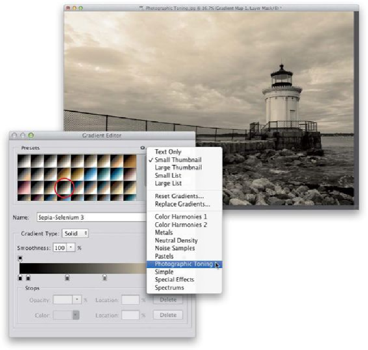
Step Four:
So, now you're pretty much window-shopping for the look you like—click a gradient, and
if it's not the look you're looking for, click the next one. For example, here I chose Sepia-
Cyan (perhaps not my first choice, but I did want to show you the variety of what's here).
This one has more of a split-tone look, with a cyan color in the shadows and a yellowish
color in the highlights. Make sure you try out some of the ones in the top row—there are
somereally usefulduotone/sepiatonelooksupthere,andlikemostAdobepresets,thebest,
most-useful ones are near the beginning, and the farther they are down on the list, the less
useful they are. One more cool thing: because these are adjustment layers, you can reduce
the intensity of the effect by simply lowering the opacity of the adjustment layer (over in