HTML and CSS Reference
In-Depth Information
grid-column: 2;
grid-row: 2;
border: 1px dotted black;
}
#blogPage > #blogRoll {
grid-column: 1;
grid-row: 4;
border: 1px dotted black;
}
#blogPage > #aboutMe {
grid-column: 1;
grid-row: 2;
border: 1px dotted black;
}
#blogPage > #bloghistory {
grid-column: 2;
grid-row: 4;
border: 1px dotted black;
}
}
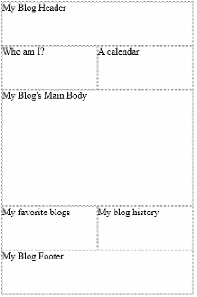
As the screen size gets to be as small as it would be on a smart phone, the user interface
will be rendered as shown in Figure 4-51.
FIGURE 4-51
The layout of the blog is adjusted for the screen size of a smart phone

Search WWH ::

Custom Search