HTML and CSS Reference
In-Depth Information
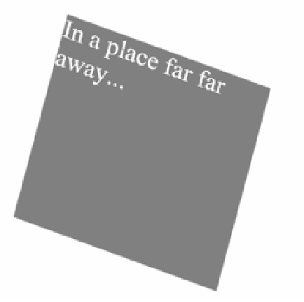
FIGURE 4-49
A
div
element being rotated in 3-D
You can experiment with each transformation. The output is similar to that of the 2-D with
the exception that the effects are applied along the z-axis as well. In addition, you can see
that you can still use the 3-D functions to achieve 2-D effects. It all depends which parameters
you specify.
In the modern world, screen size is a variable you now have to contend with when building
webpages. With many people accessing the Internet from different devices such as smart
phones, tablets, and desktops, there is no guarantee that your page will fit nicely on the
screen, and as a result, it may not be user friendly. This is where the concept of media queries
is able to help. With the use of media queries you can create a responsive user interface that
will adjust automatically as the size of the available rendered webpage changes. By using
information from the browser, you are able to determine how to present your content so that
it provides a user-friendly experience on any device.
The media query syntax is as simple as adding the following to your CSS file:
@media screen and (max-width: 800px){
}
This code will apply all the styles within the media query to the page when the width of
the screen is not wider than 800 px. To achieve a different layout for different screen sizes or
devices, you need to specify a media query for the different size ranges. To explore this, use
the blog layout that was created in Objective 4.3 using a grid layout. The default layout of the
blog is shown in Figure 4-48. However, as the screen size gets smaller, the blog gets com-
pacted to the point that it might not be readable or, depending on the amount of content,
will require awkward scrolling on a device. To accommodate the different screen sizes, update

Search WWH ::

Custom Search