HTML and CSS Reference
In-Depth Information
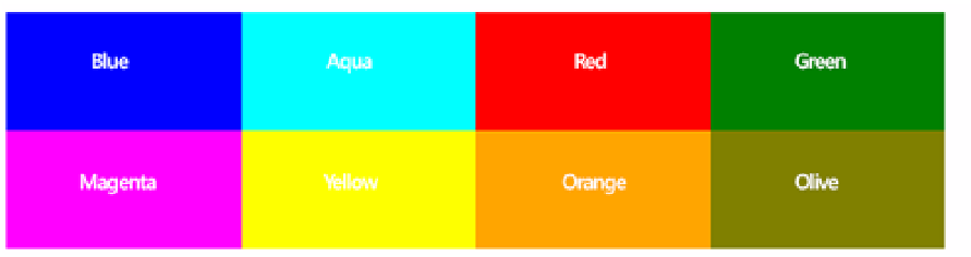
#mainGrid > div:nth-child(4){
grid-column: 4;
grid-row:1;
background-color: green;
}
#mainGrid > div:nth-child(5){
grid-column: 1;
grid-row:2;
background-color: magenta;
}
#mainGrid > div:nth-child(6){
grid-column: 2;
grid-row:2;
background-color: yellow;
}
#mainGrid > div:nth-child(7){
grid-column: 3;
grid-row:2;
background-color: orange;
}
#mainGrid > div:nth-child(8){
grid-column: 4;
grid-row:2;
background-color: olive;
}
With this code, you have instructed the elements where they should be positioned within
the grid. When the renderer processes these elements, it will now know by asking each
element where it should go and how to place them. Now the page displayed in the browser
looks like Figure 4-47. Each element is placed according to the column and row position
specified for it: blue, aqua, red, and green elements respectively in columns 1 through 4, row
1; magenta, yellow, orange, and olive elements respectively in columns 1 through 4, row 2.
FIGURE 4-47
The webpage with all the columns and rows of the grid displayed
Now with the foundation in place, you can take this a step further to create a grid that will
correspond with the table layout specified earlier. To do this, you need only a couple more
CSS properties that will provide the equivalent functionality as the
colspan
and the
rowspan
.
In addition, your styles will provide some sizing properties to ensure that the grid expands on
the page as you would like it to. This is optional of course in the real world. You may want to
have content force the sizing of your grid or you may want to explicitly specify the size.

Search WWH ::

Custom Search