HTML and CSS Reference
In-Depth Information
Add these additional styles to set background colors for the extra flexbox items:
#flexbox1 > div:nth-child(1) {
background-color: green;
}
#flexbox1 > div:nth-child(2) {
background-color: yellow;
}
#flexbox1 > div:nth-child(3) {
background-color: red;
}
#flexbox1 > div:nth-child(4) {
background-color: purple;
}
#flexbox1 > div:nth-child(5) {
background-color: blue;
}
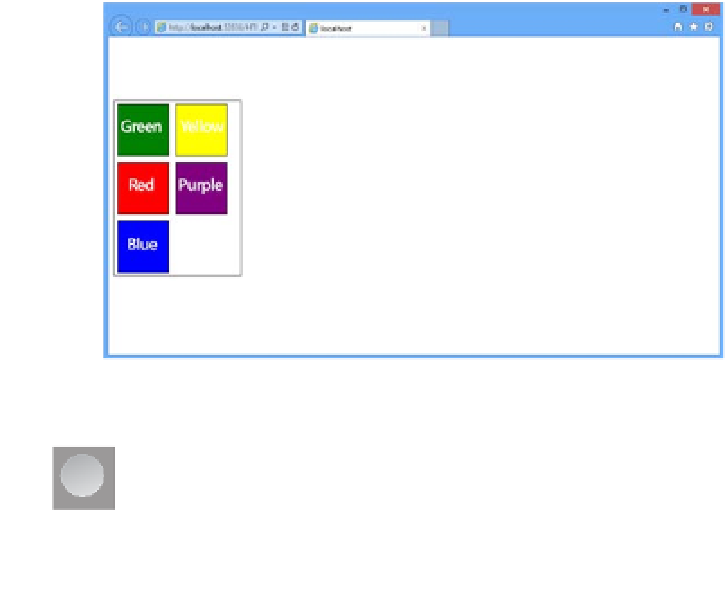
Figure 4-40 demonstrates the wrapping functionality of the flexbox.
FIGURE 4-40
Using the
flex-wrap
property to automatically wrap flexbox items
EXAM TIP
On the exam, you might see the shorthand version of what you have just done with
the wrapping. The
flex-flow:
property supports specifying the wrap style as the second
parameter:
flex-flow: row wrap
.
CSS3 provides the ability to create a layout using columns. This provides a look and feel to
the content like what you might see in a newspaper article where the content wraps up to
the next column. As with the other layout techniques, the multi-column technique starts with


Search WWH ::

Custom Search