HTML and CSS Reference
In-Depth Information
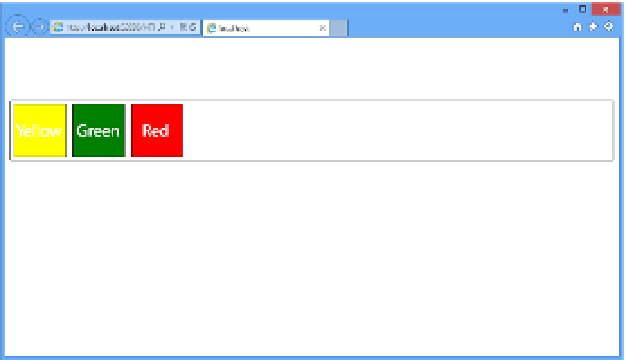
Figure 3-39 demonstrates that the flexbox items are displayed in the order you specified
instead of the default order, which would have just been in the order the items are listed in
the HTML.
FIGURE 4-39
Explicitly setting the sequence of the flexbox items with the
order
property
Another property that is important to understand is the wrapping option. Just as with text
wrapping,
flex-wrap:
provides the ability to specify what the browser should do in the event
that the content within the flexbox exceeds the available space of the flexbox itself. In this
case, you can specify that the flexbox should wrap or not wrap. An example of wrapping is
shown next. First update your flexbox to have a fixed width and then add the flexbox wrap
property:
#flexbox1 {
display: flexbox;
flex-flow: row;
flex-wrap: wrap;
border: 1px solid black;
margin-top: 100px;
min-height: 15px;
width: 200px;
}
To demonstrate the wrapping functionality, you need to add a couple more flexbox items
so that they will overflow the flexbox:
<div id="flexbox1">
<div></div>
<div></div>
<div></div>
<div></div>
<div></div>
</div>

Search WWH ::

Custom Search