HTML and CSS Reference
In-Depth Information
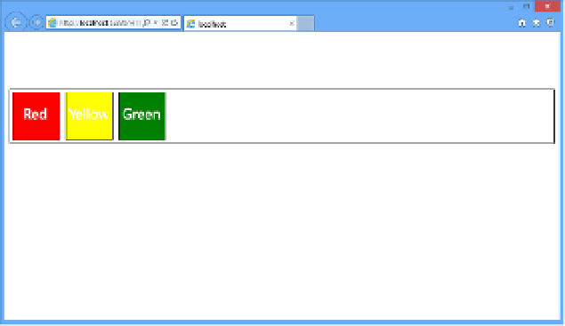
FIGURE 4-37
Flexbox content in the same order but aligned to the left end
There is also some additional functionality that provides the ability for each child element
to flex itself to take up the amount of space that is specified. If you wanted one box to take up
15 percent of the space, another to take up 25 percent and the last one to take up whatever
space is left without leaving in blank space between, you would implement the
flex
property.
The
flex
property is specified on each of the children elements to designate the amount of
space each should occupy.
You will first need to change the properties of the layout container to look as follows:
#flexbox1 {
display: flexbox;
border: 1px solid black;
margin-top: 100px;
min-height: 15px;
}
#flexbox1 > div {
min-width: 80px;
min-height: 80px;
border: 1px solid black;
margin: 5px;
}
#flexbox1 > div:nth-child(1) {
background-color: green;
flex: 2;
}
#flexbox1 > div:nth-child(2) {
background-color: yellow;
flex: 15;
}
#flexbox1 > div:nth-child(3){
background-color: red;
flex:3;
}
In the updated CSS code, the
flex
property is added to each of the children elements. The
flex
property takes a parameter that is a relative value. This is not a hardcoded measurement

Search WWH ::

Custom Search