HTML and CSS Reference
In-Depth Information
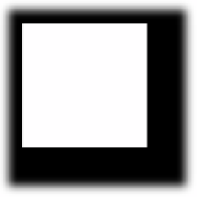
FIGURE 4-21
A
box-shadow
effect with addition of the
spread
parameter to increase the shadow's size.
Figure 4-21 shows the output of the previous code with the addition of the
spread
parameter. The
spread
parameter specifies the size of the shadow. In the context of real-world
objects and their shadows, the spread is like indicating how close a light source is to an
object. The closer the light source, the larger the shadow it produces. The
spread
parameter
can be used to elicit this type of effect on the HTML element. In Figure 4-21, the shadow was
intentionally created to be larger than the HTML box itself. This was done to demonstrate
an additional concept of the shadow effects. The shadow itself is a full-size box. In this case,
the shadow was made to be larger than the original box so it is visible around all four sides
of the box. Normally, for a box where the spread is not specified to be larger, the shadow is only
visible on the two axes specified by the first two parameters. This is because the shadow box is
offset from center of the HTML element it is shadowing. The rest of the shadow is still behind
the HTML element being shadowed. You can demonstrate this by setting the position of the
shadow to be completely away from the HTML element. This is achieved by specifying the
position to be a greater number value then the size of the HTML element. The following code
demonstrates this:
div{
position: absolute;
left: 50px;top: 50px;
width: 100px;
height: 100px;
border: solid 1px black;
box-shadow: 100px 100px 10px;
}
In this code, the position of the box shadow is set to be 100 px along the horizontal axis
and 100 px along the vertical axis, which will place the shadow to the bottom right corner of
the
div
element, as shown in Figure 4-22.

Search WWH ::

Custom Search