HTML and CSS Reference
In-Depth Information
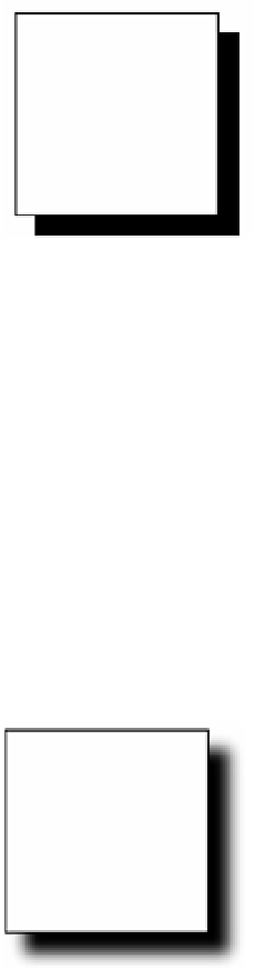
FIGURE 4-19
A simple
box-shadow
effect
The shadow effect in Figure 4-19 is a solid box shadow. To provide an effect where the
shadow fades out gradually, you will need to specify the
blur
parameter. By adding the
blur
parameter, you can create the effect shown in Figure 4-20. The following code adds the
blur
parameter:
div{
position: absolute;
left: 50px;top: 50px;
width: 100px;
height: 100px;
border: solid 1px black;
box-shadow: 10px 10px 10px;
}
FIGURE 4-20
A
box-shadow
effect with the addition of a blur
The next parameter that adds a special effect to the shadow is the
spread
parameter. This
parameter specifies the size of the shadow. The following code specifies a spread value to
increase the size of the shadow:
div{
position: absolute;
left: 50px;top: 50px;
width: 100px;
height: 100px;
border: solid 1px black;
box-shadow: 10px 10px 10px 20px;
}
This code produces the output in Figure 4-21.

Search WWH ::

Custom Search