HTML and CSS Reference
In-Depth Information
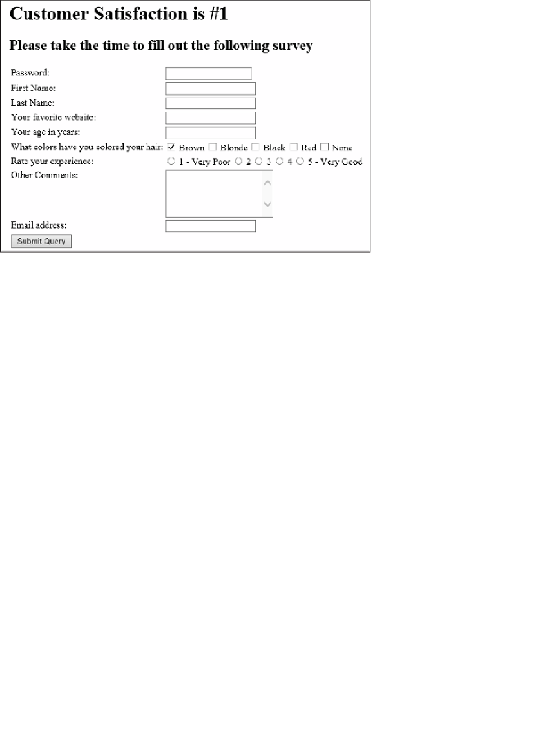
FIGURE 3-9
Adding some
radio
input types to the form
Like with the
checkbox
input types, defaulting the state of the
radio
input to selected is
possible. This is done in exactly the same way, by specifying the
checked
attribute:
<input type="radio" id="chkFive" name="experience" checked="checked"/> 5 - Very Good
In this case, the rating of 5 - Very Good defaults to selected for the group of radio buttons.
You can have multiple groups of radio buttons on the same page by specifying a different
name for each group of buttons. Another way to provide users with the ability to specify a
single value within a group of values is with the use of the range control.
Using the
range
input type
Using the
range
input type enables users to specify a value within a predefined range by
using a slider bar. This type can be used in cases where a wider range of values is required to
choose from but using radio buttons would be too unwieldy. Add another rating question to
the survey, as shown in the following HTML after the radio buttons:
<tr>
<td>How likely would you recommend the product:
</td>
<td>
<input type="range" min="1" max="25" value="20"/>
</td>
</tr>
This HTML markup provides users with a slider bar that they can use to specify a value
between 1 and 25. The
min
attribute specifies the minimum value of the range; the
max
at-
tribute specifies the maximum value. The
value
attribute specifies a default value. If you omit
Search WWH ::

Custom Search