Geography Reference
In-Depth Information
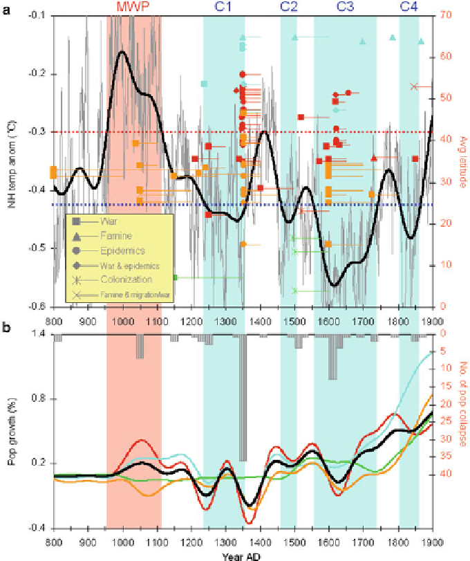
Fig. 14.4
Climate change, population collapse, and population growth in the Northern Hemi-
sphere in AD 800-1900. (
a
) Northern Hemisphere temperature anomaly (
ı
C) from the AD
1961-1990 mean and population collapse. The temperature series (
grey line
) has been smoothed
by the Butterworth 100-year low-pass filter to characterize its centennial variability (
bold black
line
).
Red
and
blue dotted horizontal lines
denote the warming threshold (>
0.3
ı
C) and cooling
threshold (<
0.42
ı
C), respectively. Regarding the details of each population collapse; the
average latitude of the relevant country/region corresponds to the right Y-axis and the associated
climatic zone is identified by colour (
red
, warmer humid zone;
turquoise
, cooler humid zone;
bright green
, tropical humid zone;
orange
, dry zone); cause is represented by a symbol (see
figure legend); and duration is revealed by the length of the line. (
b
) Population collapse and
population growth rate. The
grey bars
represent the number of population collapses in 20-year
units, which corresponds to the right Y-axis (inverted). Population growth rate in different climatic
zones is identified by colour (
red
, warmer humid zone;
turquoise
, cooler humid zone;
bright green
,
tropical humid zone; orange, dry zone), and
bold black
(Northern Hemisphere). The
red
shaded
area represents the warm phase in the Medieval Warm Period (MWP), while the
blue
shaded area
represents the cold phases in the Little Ice Age (C1-C4) (Color figure online)
Search WWH ::

Custom Search