HTML and CSS Reference
In-Depth Information
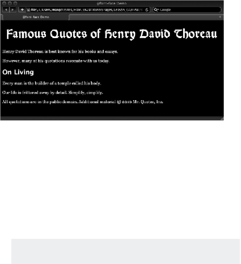
FiGure 7-2
The acceptable named values are
xx-small
,
x-small
,
small
,
medium
,
large
,
x-large
, and
xx-large
. Each browser determines how tall to render the various named values, but they are all
roughly the same.
A more precise approach is to use
font-size
with a numeric measurement system. For example, if
you wanted to define your paragraphs to be 12 pixels tall, your CSS declaration would be:
p { font-size: 12px; }
Although most browsers support a wide range of measurement systems, the majority of web design-
ers typically use pixels (
px
), percentage (
%
), or ems (
em
) for their web pages. Other systems, like
points (
pt
), can be used when specifying font sizes for print media style sheets.
An em is a percentage-based measurement equal to the width of the letter “M”
in the current font.
The height of the line can be controlled separately from the size of the font in CSS by the aptly
named
line-height
property. The default setting for
line-height
in browsers is typically 120 per-
cent of the font size, which gives a bit of white space above and below the text. You can adjust the
line-height
either by a percentage or, as in this example, a fixed value:
p { line-height: 24px; }
The effect of a
line-height
twice the size of the
font-size
is shown in Figure 7-3.