HTML and CSS Reference
In-Depth Information
You may be wondering about the two somewhat odd looking properties in the
fieldset
rule,
-webkit-border-radius
and
-moz-border-radius
. These
properties were implemented by Safari and Mozilla (Firefox) to bring a rounded
corner option to their browsers while the CSS 3 specification — which includes
border-radius
— is still in the formation phase. At this point in web design, it's
best to include all three declarations for backward and forward compatibility.
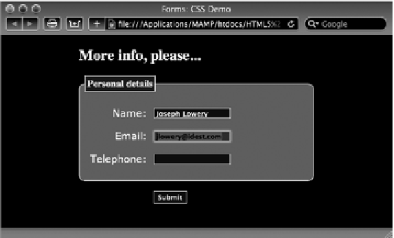
working with input Fields
Way back in Lesson 8, when discussing link styles, the
:focus
link state was mentioned. Although it
can be used for text links, this particular state really comes into play with form controls. Whenever
a user selects or clicks into a particular form control, such as a text field, that control is said to have
focus
and, thus, be in the
:focus
state. You can use this distinction to give your form controls two
different styles: one when the field is selected and one when it is not. For example, if you want to
change the text and background colors when a user clicks into a text field, here are two CSS rules you
might use:
input {
border: 1px solid #000000;
font-weight: bold;
background-color: #F5F5F5;
}
input:focus {
font-weight: bold;
color: #FFF;
background-color: #0F0
}
The different (green)
background-color
and white text values defined in the
input:focus
rule
should be readily apparent in Figure 20-7, even in grayscale.
FiGure 20-7