HTML and CSS Reference
In-Depth Information
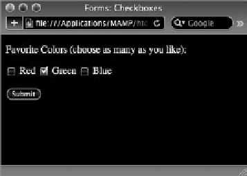
Preselecting checkboxes is handled the same way as radio
buttons, by using the
checked
attribute. Say you wanted
to have the Green option already checked when the user
first sees the page. Here's how the
<input>
tag for a
selected checkbox would be coded:
<input type=”checkbox” name=”greenCheckbox”
id=”greenCheckbox” value=”green”
checked=”checked” />
Obviously, unlike radio buttons, you can have as many
checkboxes checked as necessary.
FiGure 19-5
iMPLeMenTinG seLecT LisTs
Select lists — also known as drop-down lists — provide another way for users to make selections. Select
lists are extremely flexible and can be set up to emulate either radio buttons (with a single mutually
exclusive choice) or checkboxes (with multiple selections).
To code a select list, you'll need two separate tags, similar to ordered and unordered lists. The outer
tag is the
<select>
tag, which contains the
name
attribute and, optionally, an
id
attribute. Each item
in a select list form control is coded with an
<option>
tag. The text in between the opening and clos-
ing
<option>
tag pair is what is displayed in the drop-down list. When a user chooses a particular
select list item, the content of the
value
attribute is conveyed as the choice for the select list.
Take a look at some example code:
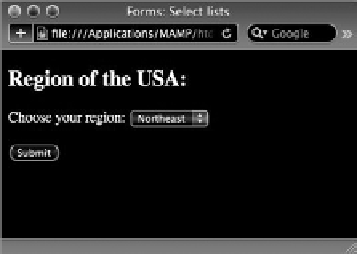
<select name=”region” id=”region”>
<option value=”ne” selected=”selected”>Northeast</option>
<option value=”se”>Southest</option>
<option value=”mw”>Midwest</option>
<option value=”sw”>Southwest</option>
<option value=”w”>West</option>
</select>
When this select list is clicked by the user, the list drops down to display the options as shown in
Figure 19-6. The first option, Northeast, is visible in the list when the list is closed.
FiGure 19-6