Graphics Programs Reference
In-Depth Information
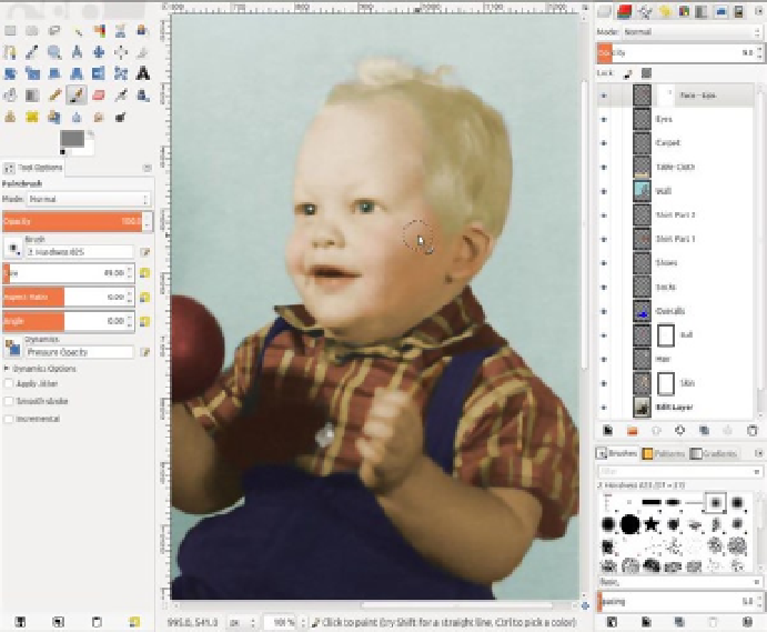
Figure 5-28.
Finishing with a hint of red in the cheeks
Your version may look a little different from this one. It's okay to choose different colors for the wall,
tablecloth, etc. The main thing is making the eyes, skin, lips, and hair look as natural as possible. For the wall
and table covering, I chose colors that looked like they would fit the time period, but they can be varied.
One thing to remember when colorizing images is that it's better to have colors that are a little
undersaturated than too saturated. Oversaturation doesn't look natural. That's why it's important to use a
separate layer for everything you colorize. You want to be able to fine-tune color intensity by adjusting layer
opacity. With practice, you can achieve results that look reasonably realistic (Figure
5-29
).
Search WWH ::

Custom Search