Game Development Reference
In-Depth Information
UI elements
You should try to imitate the behavior, but not the exact appearance, of standard UI
elements from iOS; it is better to create your own version of controls with ornamenta-
tion close to the graphic style of the game. The standard UI components will look a bit
silly if you would not have enough imagination, talent, and time to create something
customized to support the mood of your game. Another reason is the universality of
your title; usually, developers try to port their games on other platforms, where other
paradigm designs are afloat. But try to only decorate them a bit, not invent new prin-
ciples and rules. The player already has some UI experience based on iOS mechan-
ics, so he expects the same paradigm in your game.
All the UI elements are listed by Apple in
IOS Human Interface Guidelines
in the
chapter
iOS UI Element Usage Guidelines
.
There are various fields in the UI that are explained as follows:
•
Text field
: This is used by the user to enter some text input. Graphically, this
is one of the simplest kinds of UI elements: a rectangle with a small frame and
a light gradient inside. It is better to use large text fields as they look more
comfortable. Another good tip is to use text hints, for example, if you have a
text field asking the player to enter his name, try to add the text description
Enter your name here
painted light grey.
•
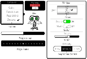
Page control
: This is a specific example of UI designing introduced exclus-
ively on mobile devices, not on desktop systems. It looks like a collection of
dots and one of them is highlighted. The main goal of the element is to show
the amount of content in the pages, and to mark the current position of the
user. Page control is extremely useful for various panels with a list of graphic
or text elements (help chapters and trophy rooms). Typically, page control is