Graphics Reference
In-Depth Information
Text in a grid with no hierarchy applied.
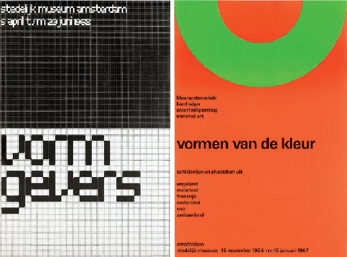
Posters designed by Wim Crouwel: 'Vormgevers', 1968 and 'Vormen Van de Kleur', 1966. These
two posters show examples of the grid system used in practice. You will notice that Wim Crouwel
left the grid system exposed on his 'Vormgevers' poster. This 28-column grid allows for maximum
flexibility in the placement and alignment of elements; all the letterforms line up exactly. The neg-
ative space also plays an important part in the composition of the pieces, allowing the viewer's
eyes to be directed to certain elements.
A grid may also be dynamic; in addition to, or instead of, horizontal and vertical lines
it may consist of diagonal or curved lines. A grid is as creative as the person design-
ing it! Conventions can be challenged or broken. Many designers have explored the
idea of breaking the grid in order to create work that reflects content with more free-
dom and emotion, allowing their creativity and instinct to guide their work rather than
the structure of a grid. A few examples by Rudy Vanderlans for
Émigré
magazine are
shown on p. 61. However, it is important to have a clear understanding of the purpose
of a grid and to know the rules before you attempt to break them!