Graphics Reference
In-Depth Information
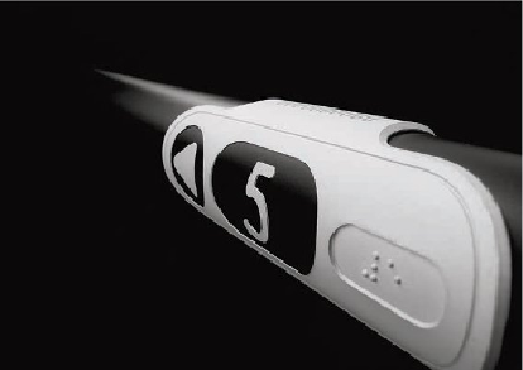
Pasamano is an award-winning wayfinding product. It has been designed to assist blind and visu-
ally impaired visitors, as well as the sighted, by Esteban Marino. The signage element was cre-
ated for use on handrails on stairs and walkways. Produced in anodized aluminium, there is a
strong contrast between the matt aluminium and the black background, which helps the viewer to
distinguish between the various elements. The information is displayed in Braille, along with clear
and legible numerals and graphic icons such as arrows and pictographs. It provides clear, intu-
itive signposting for visually impaired visitors to navigate and indicate emergency escape routes
in unfamiliar environments with ease.
Contrast
Contrast is a very important element when designing with visual impairment in mind.
It is a simple exercise, but squinting your eyes while viewing a design will let you see
how close the tonal qualities are of differing colours. If they all look the same shade
of grey, the tone is too similar. If you were colour blind, this may result in you not
being able to distinguish one colour from another. This could be problematic if you
are using typography on a background colour, or need to tell one coloured line from
another on a subway map, for example.
When designing something to be viewed or read from a distance, don't just guess
what would be an appropriate size. We get a false sense of scale when designing on a
computer screen; zooming in and out means you don't get a true representation of the
final artwork. Print out sections of type at actual size in draft form and pin them up to
mimic real scale and distance. This will help you decide on suitable sizes and weights
to use within designs.