Graphics Reference
In-Depth Information
for them to read standard-size print (categorized as text used in everyday publishing
such as newspapers, books and magazines).
There are several different types of visual impairment that a designer should consider.
This does not just involve those who are losing their sight, but those who may have
less severe conditions such as colour blindness or loss of peripheral vision. Our eye-
sight deteriorates as we age, and older eyes may have difficulty differentiating colour,
especially in low lighting conditions. An estimated 10 per cent of males suffer from
some sort of colour blindness, and around 1 per cent of women. It is a hereditary con-
dition caused by a reduced number of a particular type of visual receptor at the back
of the eye.
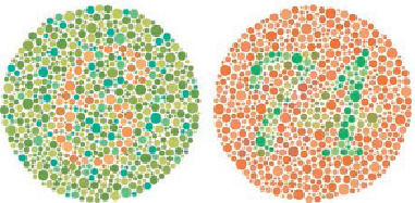
In 1917, Dr Shinobu Ishihara, a professor at the University of Tokyo, designed a test
for colour vision defects. Now known as the Shinobu Ishihara colourblind test, it uses
coloured dots placed in a pattern to present a numeral. Certain combinations are ex-
tremely difficult for people with particular types of colour blindness to read. Most
forms of colour blindness involve difficulty differentiating between either red and
blue or blue and yellow, although in some cases colour cannot be distinguished at all.
What design decisions need to be taken when visualizing information for the visually
impaired? It would be very difficult to design for every ocular deficiency. The basic
rule is to use contrast to maximum effect. Make sure that there is a large enough tonal
difference between colours to be able to distinguish them from one another.
The Shinobu Ishihara tests for colour blindness.