Graphics Reference
In-Depth Information
Facsimile painting by Charles K. Wilkinson of the Astronomical Ceiling in the tomb of Senmut,
near Luxor, Egypt, c. 1473-1458 BCE.
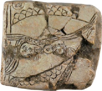
Cast of a Babylonian clay tablet inscribed with a map, c. 2500-2300 BCE, from Ga-Sur, Meso-
potamia (modern Iraq).
Charts and graphs
Today, bar charts and graphs seem such an obvious way of presenting statistical data
that it is easy to think anyone could have created them. Scottish economist and engin-
eer William Playfair (1759-1823) is often credited with the invention of bar, line and
pie charts. Large amounts of statistical data were available in the 18th century, but
this was always presented in printed tabular form. Playfair had the idea of presenting
data in illustrative form. The bar chart first appeared in his
Commercial and Polit-
ical Atlas
, published in 1786. In his
Atlas
he presented information on imports and
exports from different countries over the years, which he showed as line graphs. This
meant that the reader could see the relationship between the various economic factors
in quantitative graphical data. It was the first step towards the visualization of data.
This clever way of presenting data enables the eye to perceive instantly what the
brain would take much longer to deduce from a table of numbers. This is what makes
graphs work so well for scientists, businesspeople and others. The charts allow the
numbers to speak to everyone in the same way. They transcend the boundaries of cul-
ture, language and race: a Russian person can understand the same graph just as well
as a French person. Graphs make information easy to decode and accessible for a
much wider audience.