Graphics Reference
In-Depth Information
The KickMap 24/7 New York subway map app on a touch-screen mobile phone, designed by
Kick Design. The use of night and day modes means colour-coding must be flexible enough to
be distinguished on both a light and a dark background.
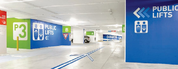
Colour as a navigational tool
The information designer can guide their readers through information by clever use
of colour. By using a single colour for the same kinds of information, the reader is
able to recognize and follow it. It unites the design and provides a landmark for the
viewer to navigate. For example, you may set category headings in a catalogue in
different colours. The colour remains consistent within those sections, allowing the
user to find their position within the document easily. The eye is highly adapted to
be able to make links between different elements of colour. Consistent use of colour
gives pointers about the kind of information, perhaps separating a category title from
a headline on the same page. Connecting colours is a subtle non-verbal way to rein-
force the connection between the two groups of information.
When choosing colours there are two factors that should be taken into account:
1) How close they are to each other on the colour wheel. By choosing colours at least
one or two shades apart from each other, you will make it easier for the reader to tell
them apart because there is more contrast.
2) Think about the background on which the colour is placed. If this is a page, what
colour will contrast with it? If in an environment, how will the lighting, either day-
light or artificial, affect the colour choice during the day or night?