Graphics Reference
In-Depth Information
using colour, there needs to be enough of a difference between the hues chosen but
also between the lightness or darkness between the type and its background. There
is no point using dark text on a dark background, even if they are different colours.
Visibility is a priority with signage. Signs need to be read at a distance and there must
be enough contrast for the message to be clearly recognized.
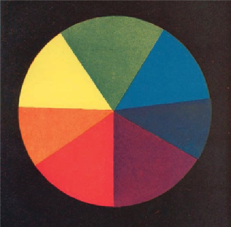
Sir Isaac Newton's colour wheel.
Colour-coding
Colour-coding is the process of attaching a specific colour to a category or group of
content to make it instantly recognizable. It is used in various guises when it comes to
conveying information. These can be abstract - for example, distinguishing between
different routes on a subway system - or they can be direct; for example, designers
have been known to use the colour green within packaging to suggest freshness or
organic produce.
So, when faced with these choices, how does the designer choose colour combin-
ations that remain readable? There are several factors to consider. It is important
that the designer makes decisions about what they are trying to achieve through the