Graphics Reference
In-Depth Information
Mark Boulton, graphic designer, speaking at Typo-Berlin, 2007
Legibility issues
When selecting fonts, two important characteristics of the letterforms affect the legib-
ility of messages: the proportions of the counterspaces (enclosed spaces within let-
ters), and the x-height of the lowercase letterforms. Fonts with large x-heights are
thought to be more legible, as the individual characters are easily differentiated from
each other. Similarly, fonts with large, open characters aid the distinction of different
letterforms. This is important when considering how the typeface will be used. An
audience may need to read text on signage from a distance or even from a moving car.
Any ambiguity within the letterforms may cause confusion.
The position that type occupies on a page is just as important as the selection and
treatment of the typography itself. For a message to be communicated clearly, all ele-
ments must work in unison to perform this operation successfully.
When considering how to use typography, it is important to assess the different func-
tions that it performs. As well as the information contained within the words them-
selves, the way in which typography is laid out on the page can also help to convey
a message or an idea. It acts as a signpost to attract attention and also explain or cap-
tion artwork. Traditionally, it was thought that serif fonts were more legible, but over
the years it has been discovered that certain sans serif faces such as Verdana are more
legible for people with dyslexia, because the characters are easily distinguished from
each other.
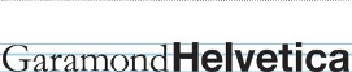
You can see in the image above that, although the fonts Garamond and Helvetica appear the
same size overall, Helvetica has a much larger x-height.