Graphics Programs Reference
In-Depth Information
3
Now, click in the color i eld, and then click and drag your selected color toward the
upper-right corner of the color i eld, making it a brighter, more saturated color. To
choose a lighter color, click and drag the selected color to the upper-left corner of the
color i eld. Even though you can select virtually any color using this method, you may
not achieve the best results.
4
Press Ctrl+Shift+Y (Windows) or Command+Shift+Y (Mac OS) to see how
Proof Colors af ects the colors in the Color Picker. Notice that colors that will not
print well in CMYK show up with in gray (gamut warning). Press Ctrl+Shift+Y/
Command+Shift+Y again to turn of Proof Colors.
Perhaps you are creating images for the Web and you want to work with web-safe
colors only. This is very restrictive, but you can limit your color choices by checking
the Only Web Colors checkbox in the Color Picker.
5
Check and uncheck the Only Web Colors checkbox to see the dif erence in selectable
colors in the color i eld.
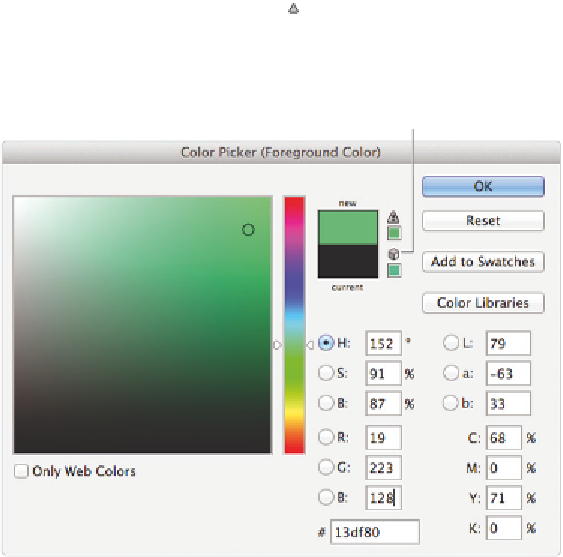
There are also warning icons in the Color Picker to help you choose the best colors for
print and the Web.
6
Click in the lower-left corner of the color i eld and drag up toward the upper-right
corner. Note that at some point, when you enter into the brighter colors, an Out of
gamut for printing warning icon ( ) appears. This indicates that although you may
have selected a very nice color, it is never going to print, based upon your present
color settings. Click on the Out of gamut warning icon, and Photoshop redirects you
to the closest color you can achieve.
A
B
C
A.
Out of gamut for printing warning.
B.
Not a web safe color warning.
C.
Only Web Colors.