Java Reference
In-Depth Information
1
// Fig. 22.14: JTabbedPaneDemo.java
2
// Demonstrating JTabbedPane.
3
import
javax.swing.JFrame;
4
5
public
class
JTabbedPaneDemo
6
{
7
public static void
main(String[] args)
8
{
9
JTabbedPaneFrame tabbedPaneFrame =
new
JTabbedPaneFrame();
10
tabbedPaneFrame.setDefaultCloseOperation(
JFrame.EXIT_ON_CLOSE
);
11
tabbedPaneFrame.setSize(
250
,
200
);
12
tabbedPaneFrame.setVisible(
true
);
13
}
14
}
// end class JTabbedPaneDemo
Fig. 22.14
|
Test class for
JTabbedPaneFrame
.
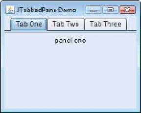
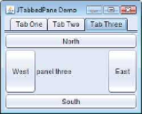
The constructor (lines 15-46) builds the GUI. Line 19 creates an empty
JTabbedPane
with default settings—that is, tabs across the top. If the tabs do not fit on one line, they'll
wrap to form additional lines of tabs. Next the constructor creates the
JPanel
s
panel1
,
panel2
and
panel3
and their GUI components. As we set up each panel, we add it to
tabbedPane
, using
JTabbedPane
method
addTab
with four arguments. The first argument
is a
String
that specifies the title of the tab. The second argument is an
Icon
reference that
specifies an icon to display on the tab. If the
Icon
is a
null
reference, no image is displayed.
The third argument is a
Component
reference that represents the GUI component to dis-
play when the user clicks the tab. The last argument is a
String
that specifies the tool tip
for the tab. For example, line 25 adds
JPanel
panel1
to
tabbedPane
with title
"Tab
One"
and the tool tip
"First
Panel"
.
JPanel
s
panel2
and
panel3
are added to
tabbedPane
at
lines 32 and 43. To view a tab, click it with the mouse or use the arrow keys to cycle
through the tabs.
In Chapter 12, we introduced three layout managers—
FlowLayout
,
BorderLayout
and
GridLayout
. This section and Section 22.10 present two additional layout managers
(summarized in Fig. 22.15). We discuss them in the examples that follow.