Java Reference
In-Depth Information
Step 1: Changing the Root Layout from an
AnchorPane
to a
GridPane
Open
TipCalculator.fxml
in Scene Builder so that you can build the GUI and delete the
default controls, then change from the default
AnchorPane
to a
GridPane
:
1.
Adding a
GridPane
to the Default Layout.
Drag a
GridPane
from the
Library
win-
dow's
Containers
section onto the default
AnchorPane
in Scene Builder's content
panel.
2.
Making the
GridPane
the Root Layout.
Select
Edit > Trim Document to Selection
to make the
GridPane
the root layout and remove the
AnchorPane
.
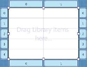
Step 2: Adding Rows to the
GridPane
By default, the
GridPane
contains two columns and three rows. Recall that the GUI in
Fig. 25.10 consists of five rows. You can add a row above or below an existing row by right
clicking a row and selecting
Grid Pane > Add Row Above
or
Grid Pane > Add Row Below
.
After adding two rows, the
GridPane
should appear as shown in Fig. 25.12. You can use
similar steps to add columns. You can delete a row or column by right clicking the tab con-
taining its row or column number and selecting
Delete
.
Tab for selecting column 1
Tab for selecting row 0
Fig. 25.12
|
GridPane
with five rows.
Step 3: Adding the Controls to the
GridPane
You'll now add the controls in Fig. 25.10 to the
GridPane
. For those that have
fx:id
s (see
Fig. 25.11), while the control is selected, set its
fx:id
property in the
Inspector
window's
Code
section. Perform the following steps:
1.
Adding the
Label
s.
Drag
Label
s from the
Library
window's
Controls
section into
the first four rows of the
GridPane
's left column (i.e., column 0). As you add each
Label
, set its text as shown Fig. 25.10.
2.
Adding the
TextField
s.
Drag
TextField
s from the
Library
window's
Controls
section into rows 0, 2 and 3 of the
GridPane
's right column (i.e., column 1).
3.
Adding a
Slider
.
Drag a horizontal
Slider
from the
Library
window's
Controls
section into row 1 of the
GridPane
's right column.
4.
Adding a
Button
.
Drag a
Button
from the
Library
window's
Controls
section into
row 4 of the
GridPane
's right column. You can set the
Button
's text by double
clicking it, or by selecting the
Button
, then setting its
Text
property in the
Inspec-
tor
window's
Properties
section.
The
GridPane
should appear as shown in Fig. 25.13.