HTML and CSS Reference
In-Depth Information
The order of the three length values is fixed, but the color value can come before or after them. Although the
color is optional, omitting it usually produces unsatisfactory results. To create a realistic shadow, it's best to use a
color with alpha transparency. All browsers that support
text-shadow
also support the
rgba()
and
hsla()
color
formats.
The styles in
text-shadow.html
contain the following classes:
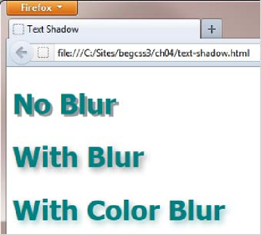
.no-blur {
text-shadow: 0.1em 0.1em rgba(0,0,0,0.4);
}
.blur {
text-shadow: 0.1em 0.1em 0.2em rgba(0,0,0,0.4);
}
.color-blur {
text-shadow: 0.1em 0.1em 0.2em rgba(0,102,102,0.4);
}
Figure
4-15
shows the result in a browser.
Figure 4-15.
Adding a blur radius to a text shadow produces a more subtle effect
All classes use the same horizontal and vertical offsets, which position the shadow
0.1em
(one-tenth the
height of the font) to the right of the text and below it. The first two classes use the same color (black with 40
percent alpha transparency), but only the second one has a blur radius, which softens the effect. The final class
uses a similar color to the text.
Adding Multiple Shadows to Text
You can add more than one shadow to text by creating a comma-separated list of shadow definitions. Figure
4-16
shows examples of text effects using multiple shadows in
text-shadow multi.html
.