HTML and CSS Reference
In-Depth Information
Using Percentages to Set Font Sizes
Using a percentage value changes the font size in relation to the size inherited from any parent or ancestor
element, resulting in the same multiplier effect as with
em
units. The HTML markup in percentages.html looks
like this:
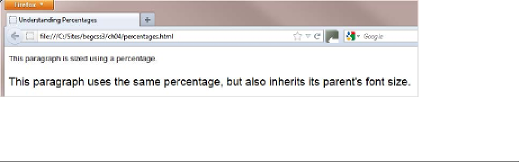
<p>This paragraph is sized using a percentage.</p>
<div id="parent">
<p>This paragraph uses the same percentage, but also inherits its parent's font size.</p>
</div>
The font sizes are specified with percentages like this:
p {
font-size: 87.5%;
}
#parent {
font-size: 150%;
}
Figure
4-4
shows the output in a browser.
Figure 4-4.
Setting font sizes in percentages also has a multiplier effect on nested elements
■
it should be apparent from the results that when used to set the font size, an
em
is the same as a percent-
age expressed as a decimal fraction.
Tip
Which Method of Setting Font Sizes Should I Use?
In the early stages of learning CSS, there's no doubt that using pixels to specify font sizes is the safest. Trying to
compensate for the multiplier effect of ems and percentages will test your patience to the limit. When you specify
measurements in pixels, you get what you expect.
Once you feel more comfortable with CSS, start experimenting with percentages. The advantage of using
percentages is that they make your designs easily scalable in the browser, which is important for accessibility.
Using percentages is also recommended to ensure that type is legible on mobile devices.
Disputes of an almost religious nature have raged over the alleged superiority of a particular method of
specifying font sizes. There is no truth in suggestions that ems are “better” than percentages or vice versa. In the
end, the browser converts both of them to pixels.