HTML and CSS Reference
In-Depth Information
#pixels
ID selector sets the font size of the
pixels <div>
to
24px
, but this has no
effect on the paragraph nested inside. The paragraph gets its size in pixels from the
#pixels p
descendant selector, which overrides both the original
p
type selector and the
#pixels
ID selector.
•
he
■
it's worth spending some time studying this example, because it illustrates two important principles:
inheritance and specificity (see
Chapter 2
). The
#pixels p
descendant selector overrides the other selectors not
only because it's lower down the styles, but also because it's more specific. Try moving the
#pixels p
style rule to
the top of the
<style>
block. The font sizes remain unchanged. Then change the value to, say,
18px
. Only the final
paragraph changes size. See also the “length” section of
Chapter 3
for an example of how
em
units can result in
ever shrinking text.
Tip
As this example shows, using
em
to set font sizes can be difficult. If you're not careful, changing the font
size in a parent element can have a domino effect on the rest of your styles. On the other hand, resizing all text
proportionately might be exactly what you want.
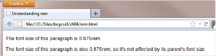
To see how
rem
avoids this multiplier effect, take a look at
rem.html
. The HTML looks like this:
<p>The font size of this paragraph is 0.875rem.</p>
<div id="ems">
<p>The font size of this paragraph is also 0.875rem, so it's not affected by its
parent's font size.</p>
</div>
The font sizes are set like this:
p {
font-size: 0.875rem;
}
#ems {
font-size: 1.5em;
}
Instead of
em
, the rule for paragraphs uses
rem
, which is calculated relative to the font size of the root element
(usually the
<body>
). If—as in this case—no font size is set for the root element,
rem
uses the browser default. As
Figure
4-3
shows, the multiplier effect is eliminated in a browser that supports
rem
.
Figure 4-3.
Modern browsers eliminate the multiplier effect with rem units