HTML and CSS Reference
In-Depth Information
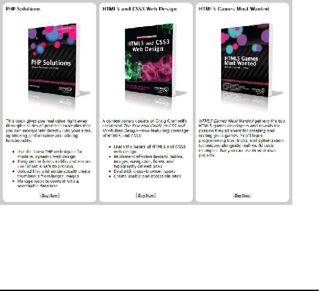
Compare your styles with book2.css if necessary.
Obviously, this topic display represents only a page fragment. But it shouldn't be too difficult to envisage
how it could be adapted as the center section of a page by making the middle column proportionately wider
than the others. Assuming the middle column contains the most important content, it would come before the
others in the underlying HTML and be repositioned using the
order
property. For an example, see
flex_layout.html in the ch22 folder.
Other Features to Look Forward To
In the remaining pages, I briefly describe new CSS features that are being actively developed. Some have
already started to appear in browsers. Others are still ideas that may or may not come to fruition. All the features
described in the following sections are subject to change.
Checking Whether a Browser Supports a Feature
Not knowing whether visitors to your site have a browser capable of displaying a particular feature is one of the
most frustrating aspects of web design. The CSS3 Conditional Rules module (
http://dev.w3.org/csswg/
css3-conditional/
)
proposes a simple way of checking with an
@supports
rule, which works in a similar way to
media queries (see Chapter 17).

