HTML and CSS Reference
In-Depth Information
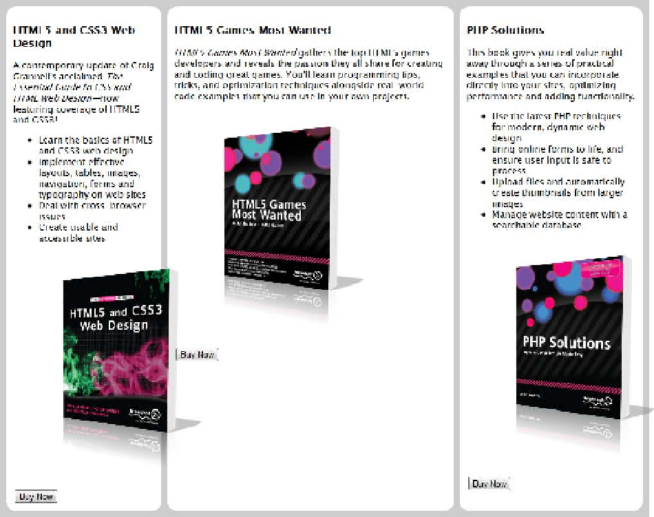
Figure 22-33.
Turning the parent element into a flex container has created three equal-height columns
4.
Because they're inside a flex container, the
<article>
elements have been
converted automatically into flex items. To make them equal width, you could set the
flex-basis
component of the
flex
property to
33.3%
, but that commits the design
to always having three columns. Instead, set the
flex
property to
1 1 0
. This gives
each column the same width even if you add an extra
<article>
or remove one.
Change the style rule for the
<article>
elements like this:
article {
background-color: #FFF;
margin: 5px;
border-radius: 15px;
padding: 10px;
font-size: 14px;
-webkit-flex: 1 1 0;
flex: 1 1 0;
}

