HTML and CSS Reference
In-Depth Information
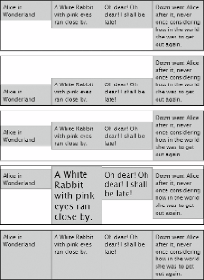
flex-start
flex-end
center
baseline
stretch
Figure 22-31.
Flex items can be aligned in a variety of ways in a flex container
eXerCISe: BOOK DeSCrIptIONS
The following exercise shows how to convert Listing 22-1 into a three-column display of books (see
Figures
22-1
and
22-2
) using flex layout.
Use as your starting point books_begin.html and styles/books_begin.css in the ch22 folder. At the time of
this writing, the only browser that supports the final syntax of flex layout is Chrome 21 with the
-webkit-
browser-specific prefix. The instructions include both the prefixed and unprefixed properties.
By the time you read this, other browsers are likely to have adopted the new syntax with or without
1.
Load the page into a browser. It has been given a few basic styles, but all three
book descriptions fill the width of the screen and are stacked on top of each other.
Figure
22-32
shows the first book. Everything is left-aligned, and the topic image is
between the text and the
Buy Now
button.